Portals
- Dennis Mergemann (Unlicensed)
- Jennifer Huber (Unlicensed)
Portals offer new ways to interact with your panelists, forming a community and collecting feedback in various ways, may it be through discussions between panelists or by taking part in surveys directly from a portal‘s interface. Qualification of survey results or the joint development of survey topics are easily feasible for each survey project.
First steps in Portals
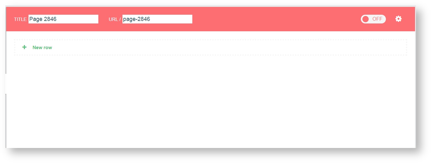
After clicking on the Portals icon located in the navigation bar of EFS, you will be routed to the Portal Overview. Portals can be created and imported. Your new portal will be accessible only for registered panleists by default. This setting can be changed in the procress of configuring your portal.
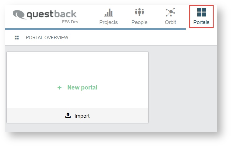
In order to create a new portal, you click on the tile button + New portal. A new tile for the portal created will be displayed. If this is your first portal, the tile will be labeled Portal 1. Portals added after that will carry increasing sequential numbering. Any new portal comes with pre- defined pages, including layout and page modules.
Edit portal in the overview
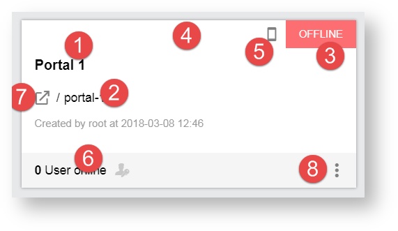
Once you have created a portal you can change its default name and access several settings right on the tile in the Portal Overview. In addition to that, you will get the information on how many users are currently online and how many have logged into your portal (e. g. 16/40 would mean that 16 out of 40 registered users are currently online).
Possible actions are:
- edit portal name
- edit URL name manually
- view portal status: online or offline
- open portal, accessing the front page
- mobile integration, allowing usage of Portals with app
- view amount of registered panelists and the share of which is currently online
- switch to exterior view of the portal
- 3 bar menu
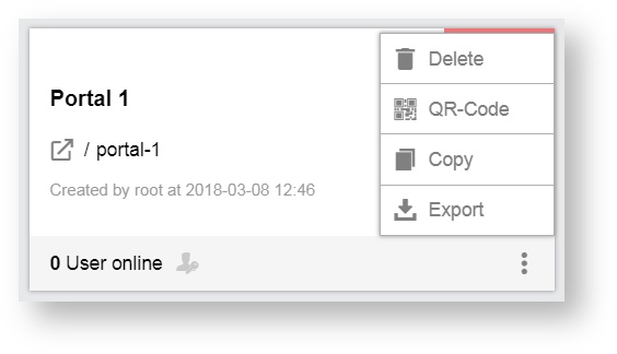
Possible actions that you can perform via the 3 bar menu are:
- Deletion
- QR-Code
- Copying
- Export
Information
Your portal's URL will be displayed as follows: InstallationURL/portal/your_portals_URL
Please note that the URL name will be automatically adapt to any portal name changes and therefore will not need to be updated manually.
However, if you choose to edit the URL name manually, the portal name remains unaffected. Note that this will prevent the URL to further adapt to any name changes made to the portal in the future.
Edit the name of a portal
You can edit the name of the portal right from the tile. You click on the tile menu icon in the bottom right hand corner of your portal tile.
You select between copying or deleting the portal.
- If you click on the delete icon, you will be asked to confirm your choice, only then the portal will be added.
- If you click on Copy, the portal will be copied.
The deletion of a portal cannot be undone and the copying may take up to a few minutes.
Open portal to access exterior view
The interface accessed by your panelists is called the exterior view. Panelists interact with each other, or take part in discussions or surveys. While editing your portal you may want to access the exterior view on the portal from the administrative interface, in order to check layout and design, etc.
In this case you can access your portal‘s default landing page from the portal tile in the Portal Overview.
- You click on the icon to the left of the URL name field.
You will be required to log in with your panelist account information in order to enter the portal.
- You enter the login information
After logging in, you will be directed to the default landing page specified within the settings area of your portal.
Ensure that your panelist account has sufficient access rights to allow logging into your portal.
Information
To reset the password, an e-mail will be sent to the portal user. The e-mail contains a link that will direct the user to the recovery page. Under certain circumstances, the code of the URL loses its validity. Portal users are then redirected to the portal's landing page instead of being given the opportunity to set a new password. The code of the URL won't be valid:
- after two hours
- after setting a new password
The code of the URL of the previous e-mail won't also be valid after a new request for an e-mail to set a new password.
View and download the portal QR code
Having a QR-code can provide quick and easy mobile access to your portal for your panelists. You click on the QR-code icon in the top left of the portal tile.
The QR-code will be displayed and may be scanned with a suitable application on a mobile device, or may be downloaded in order to be printed on a flyer or poster, for example.
- You click on the download icon and proceed with the download.
Editing portal and portal CMS
The other editing and options are available once you have entered the administrative interface of your portal, i. e. the portal CMS. You open your portal from the Portal Overview by clicking on its tile.
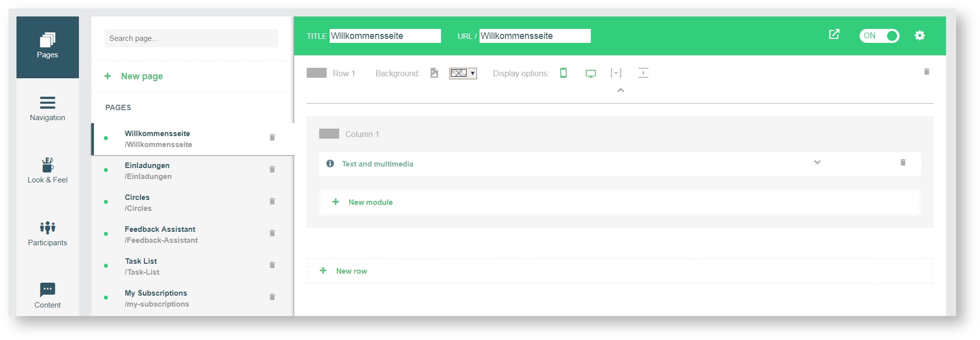
You will be directed to the sub-navigation field Pages by default. You can now access the various settings available, create pages, add page modules and determine the layout and content of your portal‘s pages. Several tabs are displayed to the left, each containing a set of options. The default Portals package comes with a set of pre-defined pages, a set of Standard pages and Target pages. Pages defined as Target pages cannot be deleted as they are crucial to an intact navigation between pages. The layout configurations (rows and modules) for the page currently selected are displayed on the content area to the right. New pages will appear empty as they do not contain rows or modules yet.
Standard pages und target pages
The default Portals package includes the following pages (Standard pages and Target pages).
Name | Description |
|---|---|
| My Subscriptions | This page contains a list of all subscriptions of a user. |
| Discussionboard | Infrastructure for discussions. Contains one single column row fitted with the Discussion board module. Default access right: Registered users. |
The following target pages are available:
Name | Description |
|---|---|
| Public Home | This page is defined as target page and can be accessed without login. Contains one multi-column row, fitted with the Login/Registration module in the center. Default access right: Public. Target page is default landing page. |
| My Home | After log in a panelist will be directed to their personal portal overview where other panelists‘ activities are displayed. Contains one multi-column row, the narrow one fitted with the Survey list module, the wider one fitted with the Activity stream module. Default access right: Registered users. Target page after successful login. |
| Profile | A panelist‘s personal profile page. Contains one single-column row, fitted with the Public Profile module and the Activity Stream module. Default access right: Registered users. Target page for user profiles. |
| Discussion | Can be added to a discussion module to display specific discussions (must be defined for each module) Contains one single-column row, fitted with the Discussion module. Default access right: Registered users. Target page for single discussions. |
| Terms & Conditions | Contains one single-column row fitted with the Text and Multimedia module. Default access right: Public. Target page for the link Terms and Conditions e. g. on registration form. |
| Notifications | Displays notifications to content a panelist has subscribed or previously commented on, etc. Contains one single-column row fitted with the Notification Center module. Default access right: Registered users. Target page for the link on alerts visible on header in exterior portal view. |
| Topics | This page displays the available topics. |
| Reports | This page contains a list of available reports. This target page is initially set to offline mode. |
Furthermore you will find several tabs to the menu at the far left, each containing a set of possible options. These are:
- Pages
- Navigation
- Look & Feel
- Participants
- Content
- Settings
Who can access your portal
By default any panelist is allowed to access your portal. You decide to restrict access to particular groups of panelists only, adjusting the access permissions in the Portal Settings. It is also possible to restrict access to panelists with a specified panel status. Terms and Conditions will have to be accepted by panelists registering to your portal.
Subnavigation: Pages
All your portal pages are listed on the left side. A default set of target pages will be displayed in the category Target Pages, with the first one being selected and its settings displayed to the right.
You justifiy the following options:
- Status
- Page edit mode
- Adding a new page
- Editing page settings
- Searching for pages
- Designing a page
- Adding a new page module
You delete a page by clicking on the trashcan icon. There are two types of pages: Standard pages and Target pages.
Information
Any standard page can be defined as a target page on the sub-navigation field Settings under the tab Page connections. Pages defined as target pages cannot be deleted as they are crucial to an intact navigation between pages. If a target page must be deleted it must first be replaced as a target in the general settings menu by defining another page as the target. Once a replacement target page has been defined, the former target page will be displayed as a standard page (if no target is defined for this page) and can be deleted.
Status
There are two statuses on page level: offline and online. The colored page header informs you about the status of the page you are currently on.

Red indicates that the page is offline currently. Offline means: The page is in the offline mode and cannot be loaded from panelists with access permission.

Green indicates that the page is online. Online means: The page is in live mode and can be loaded from panelists with access permission.
You click on the sliding switch to switch the status of your page from offline to online mode and vice versa. You can easily edit a published page in online mode, since changes to the page will only be visible when you publish the changes specifically.
Page edit mode
As soon as you create new pages or edit existing ones, the page editor is active. You can end this mode by either publishing or discarding your changes. Click on the button Publish to put your changes online and on the button Discard to delete your changes.

The page editor mode prevents direct changes to live pages during working on pages.
Adding a new page
A default set of pages will be at your disposal after creating a new portal. Additional pages can be added if necessary.
- In order to create a new page, click on + New page to the top left.
- A new page will be added instantly. The new page will be set to offline by default.
- If this is the first page you have created for this portal, you will see the category Standard Pages added to the list of pages, just above the Target Pages category.
Editing page settings
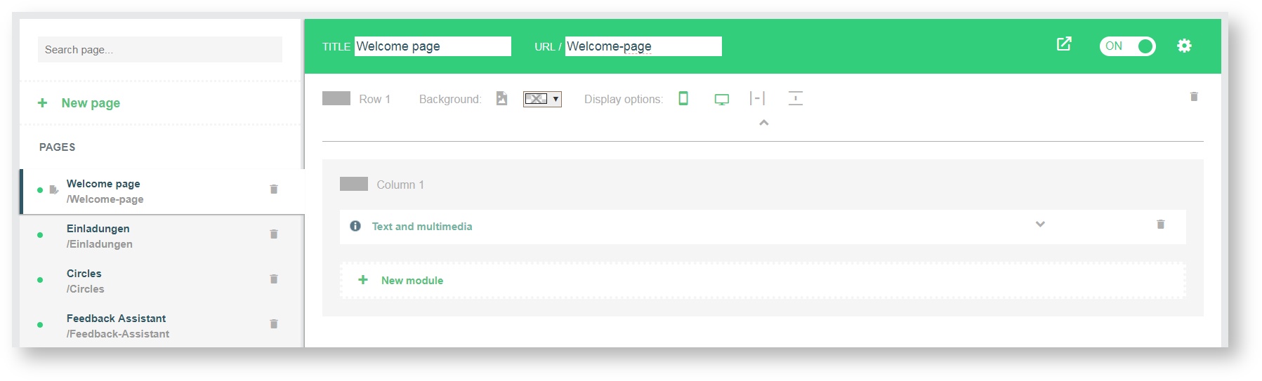
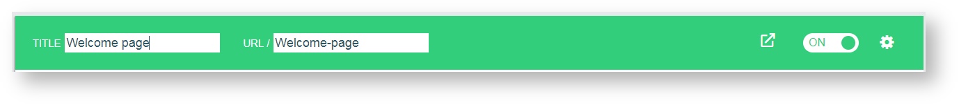
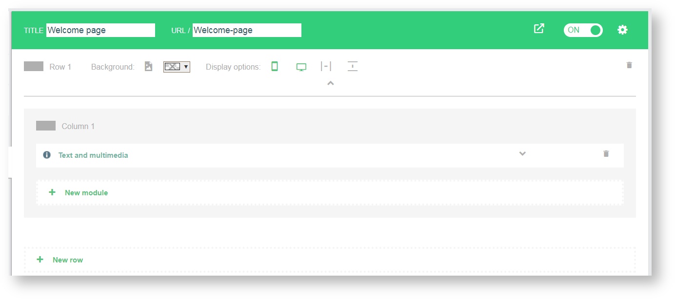
The header of the content area provides you some features. You enter the desired page titel in the respective text field and edit the page URL next to it. The icon leads you to the exterior view of your portal.
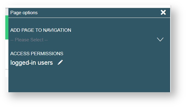
By clicking on the gear icon, the page options panel which is inserted from the right allows you to:
- add the page to navigation
- assign access permissions
Adding page to navigation
You specify which navigation element can be used in the exterior view of the portal to select the page. After clicking on the gear icon in the header, you use the drop-down arrow to display the list of the selectable navigation elements.
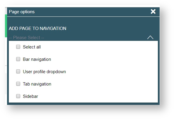
You can choose between:
- Select all
- Bar navigation
- User profile dropdown
- Tab navigation
- Sidebar
Page title and URL
The page title and URL relation works just as it does with the portal‘s title and URL relation.
- In order to change a page‘s name, click into the respective field, delete the entry and type in a new name.
- Press Enter or click any place outside the name field in order to save your changes.
The URL will adapt accordingly, if it has not been altered manually before. The URL will adjust to any title changes you make but be aware that once you manually edit the page‘s URL it will no longer adapt automatically to any future changes of the page name.
Page options
You can decide whether your page will be visible for everyone (public), or whether you want to restrict access to logged-in users, or to groups. You click on the pen icon and assign access permissions to one of the three options:
- Public
- logged-in users
- Group members
If you select Group members, a list of all created groups is displayed. Only panelist accounts meeting the criteria selected will now have access to the page‘s contents. The default setting is logged-in users.
Searching for pages
Use the incremental search function just above the button + New page to search for a specific page. You type in the name or part of the name of the page into the Search page entry field.
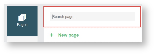
As you type, possible matches will be filtered and displayed.
- Select the desired page from the list.
- If there is no matching page, the list of pages will be empty.
- Delete your entry and try for alternative names.
Designing a page
A page‘s content can be presented in different ways. The default Portals package include pages with a default design which can be changed and adjusted to your needs.
New pages come along completely “naked” and must be given structures first in order to add content.
Adding new rows to pages
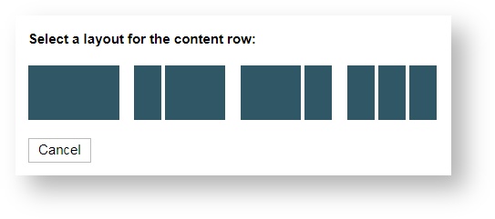
All pages consist of rows and each row layout can be adjusted. Four layout options are available.
- Single column
- Two columns, a narrow left column and a wider right column
- Two columns, a wider left column and a narrow right column
- Three columns
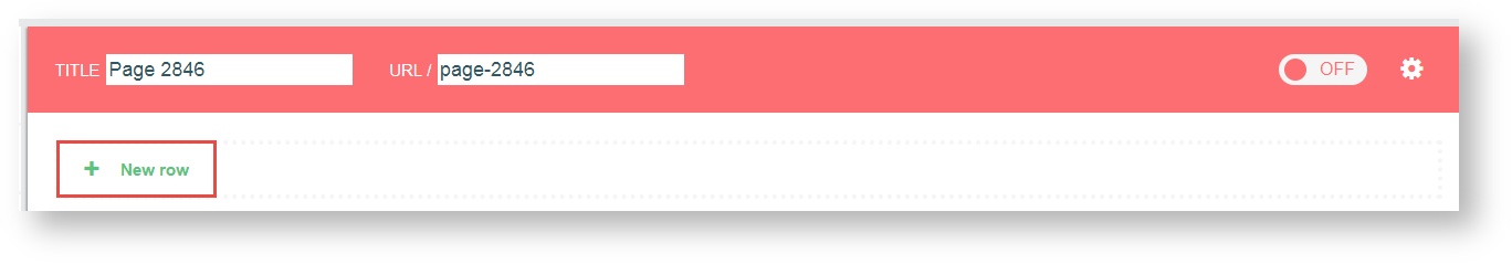
To add a new row, click on + New row on the content area and select a layout which will best suit your purposes. This selection cannot be changed later, in this case, a new row must be added configured to meet your requirements, and the original row will have to be deleted.
After you have made your selection columns will be displayed according to the selected layout. The order of display will be from left to right, with the left column being displayed at the top. If you chose a two column, narrow left layout, the narrow column will be displayed first, with the wider one to follow below it.
You can add as many rows as suit your preferences. The + New Row button will be displayed at the bottom of your content. When configuring pages in the admin area of a portal, certain modules will only be available for specifically adapted layouts. This way, misconfiguration can be avoided and modules will always be displayed using the ideal view.
Row settings
For each row and column you will be given further options to influence your page‘s visual appearance. It is also possible to select a background image or a background color for each row on a page.
Background (Image)
- To select an image, click on the image icon.
- Select an image file from your computer.
- The image will be uploaded. Currently supported file types are JPEG and PNG. It is recommended to keep the file size small as images will not be processed after upload.
Background (Color)
- If you prefer a color to an image, click on the drop down list box.
- A window with a color palette will open.
- Choose a color from the color palette or enter a hex color code into the entry field below the color palette.
- Choose a color from the color palette or enter a hex color code into the entry field below the color palette.
- By default there will not be any color set initially.
Display options
- Using display options you can manage your content to be displayed in a way that it meets the requirements of one or more specific output devices.
- Default setting for a new row is that it will be visible for devices with small and large displays and the row content will be displayed with the layout‘s default margins.
- You can set it so that either or both of them are not visible.
Delete row
- Rows which are no longer required or have become redundant can be deleted from the layout.
- Delete a row by clicking the trashcan icon to the far right.
Information
Note that the columns together with the entire content will be deleted with a row. This action is final and cannot be undone.
Adding a new page module
Page modules can be added to columns. There are various page modules with specific purposes available. As an example, on a login page, you will need the Login/ Registration module.
- In order to add a new page module, you click on + New module.
- A list of available modules opens.
- Select a page module from the list.
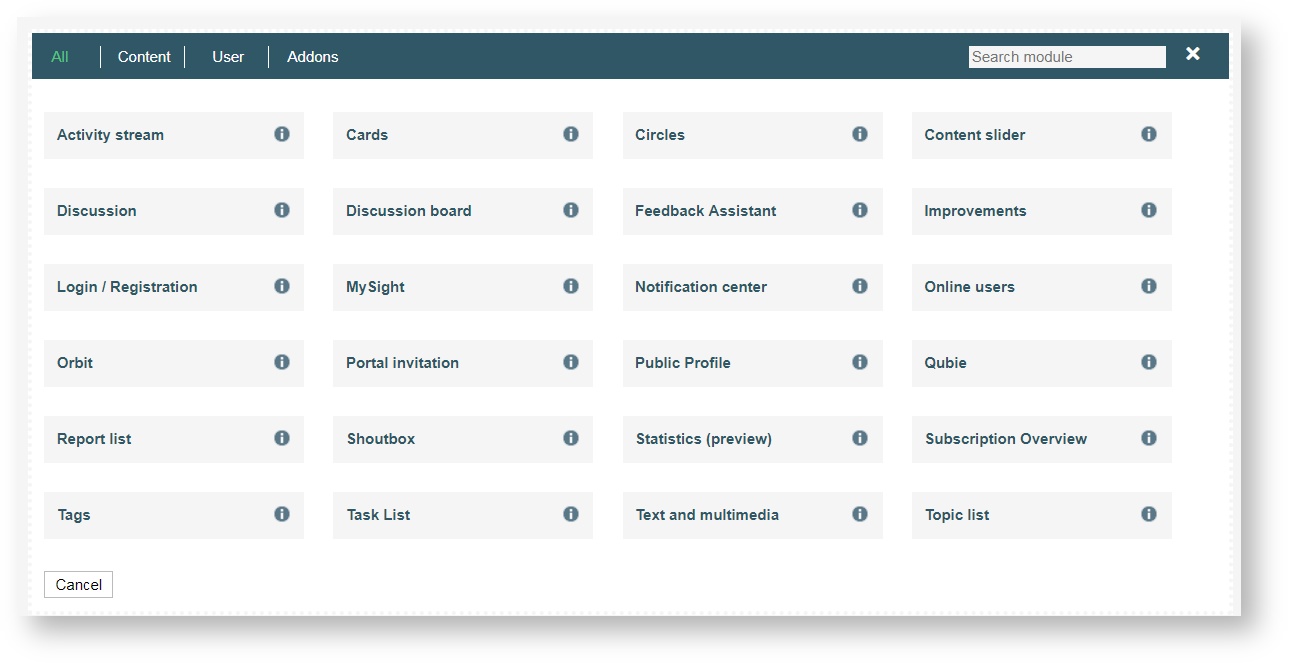
- For a good overview, the page modules are divided into different categories by which you can filter and quickly find modules.
- Via search function, you can filter modules directly.
You can add various modules to a row, either into different columns or into the same. If more than one module is placed into one column, they will be displayed on the exterior portal view in the order they have been added. However, you can move the modules using the arrow icons for each module until all modules are located at the desired location.
Some modules just need to be added, no further settings required, others can or must be further configured. Modules can be moved on page level (within or between rows) via drag & drop or arrow buttons. The page modules are displayed collapsed initially. Detail settings for page modules will be visible when they are opened. Furthermore, most of the modules can be renamed.
Modules
The standard modules are automatically available after the activation of Portals.
Discussionboard
The discussion board page module provides the panelist with a list of available discussions. The content must be defined in the detail settings. While discussions can be used in multiple modules and are not restricted to use in discussion board modules, discussion boards must be associated with at least one discussion created in the tab Content. A default discussion board is provided for the default Portals package.
Discussion
This module displays single discussions when selected e. g. from the discussion board list, as described above. However, discussion modules are not restricted for use in discussion board modules only, as the source can be e. g. a search result, the discussion list, or a notification.
Login/Registration
The login module can be displayed in three different ways:
- as login form only
- as registration from only
- both as login and registration form
Details required for login must be defined in the access permission settings.
Text and Mulitmedia
The text and multimedia module lets you present plain texts and pictures or videos to your panelist community. Once you start typing/ pasting content into the entry field, a box presenting a set of editing tools will appear, similar to tools known from text processing programs. You can drag and drop the box to position in anywhere within the window.
You also have placeholders in the editor that allow you to display user-specific profile information and master data in the external view. You create variables in the sub-navigation field Settings under the tab Profile Settings.
A list of the variables available to you can also be displayed in the exterior view by typing #showWildcards# into the input line during module integration. You should restrict this functionality to editing and development scenarios.
Click Save to save all your entries. All changes must be saved, or they will be lost, this cannot be undone.
Cards
This module will display all surveys available to the panelist or display featured discussions.
Public Profile
This adds a public profile to the panelists personal access area, which they can configure to a certain extent, e. g. add a profile picture or a specific personal header.
Content Slider
This module enables you to present content like graphics in a dynamic way and to design a picture gallery. Number and display duration for individual slides, font size and font color are definable. The font size varies from XS to XL.
Activity stream
Displays the activities of all fellow panelists in the same portal. Select whether to display a preview of your content and the number of entries displayed.
Notification center
Notifications will be displayed for panelists, e. g. when surveys are available or when there are updates on specific content a panelist has subscribed. Notification alerts will be displayed via the notification icon in the header of the exterior view. Whenever more than four notifications are available, the option show more will be displayed. The notification center module is the list of all notifications available for a panelist and should be placed on the target page for notifications.
Topic list
Lists available topics and their subtopics used for e.g. discussions.
Tags
This module lists the available tags, either
- for all discussions available, or
- for specific discussions (tags of specific discussion board only)
More frequently used tags will be displayed at the top, while less frequently used tags will be displayed at the end of the list. The number of tags displayed can be defined. Panelists can click tags displayed in this module. The search function will open and display the specific tag in context.
Online users
Displays all users currently online. Choose between displaying users profile pictures or profile tiles. The profile pictures and tiles will direct a user to the respective profile if clicked. The Online user module lets you define the amount of users displayed.
Shoutbox
Any panelist can publish content through the shoutbox, whether it is text or pictures. The content can be assigned various topics available. The owner of the post and panelists with moderator roles can edit, hide or delete shouts.
Shouts can be commented. Comments are hidden by default and can be displayed by opening the comment section through the arrow button. Replies to comments are possible and comments can be up- or downvoted as is possible in discussions.
Subscription overview
Displays the users subscriptions of topics and discussions. A panelist can access subscribed topics and discussions from here or delete subscriptions.
Dashboard aggregated
Displays aggregated dashboard results for HR und is therefore only available for users with HR role.
Subnavigation: Navigation
The navigation contains four tabs: Bar navigation, User profile dropdown, Tab navigation and Sidebar. Generally, you can add any page available to each navigation, however, the user navigation is designed for pages and content related to the individual panelist, such as profile page.
They are referred to as content pages. Particular pages like target pages for single discussion overview should not be placed in the navigations as the content of these pages is determined dynamically.
You can add links to any page on your portal‘s navigation, change their order or delete the links.
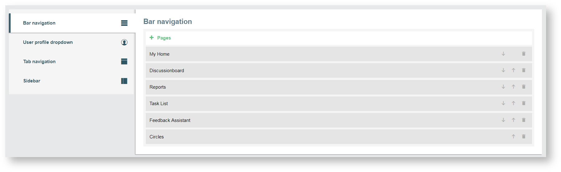
Bar navigation
The Bar navigation comes in the form of an overlay menu. It can contain all available pages a panelist can navigate to in general, e. g. target pages or additional pages. To open the main menu in the exterior view, click on the menu button at the top right of the exterior view - the linked pages of the main navigation are opened.
User profile dropdown
The same is valid for the User profile dropdown - you can add any contents you like but ideally it stands out from the Bar navigation to offer the panelist specific user oriented functions, such as their profile or log out.
Tab navigation
The Tab navigation has a horizontal menu navigation, in contrast to the Bar navigation, and can either be used in addition to the main navigation or instead. The Tab navigation is always visible in the exterior view.
Adding new pages to your navigation
While your portal evolves and new pages are added, the navigation does not adjust automatically and must therefore be changed manually. From the sub-navigation field Navigation you select either Bar navigation, User Profile Dropdown, Tab navigation or Sidebar.
Any page already added to navigation will be displayed.
- Click on + Pages.
A drop-down menu including all pages will appear.
- Select a page from the list.
- Click the green check mark to the right of the drop-down menu.
The page selected will be added to your navigation.
Change the order of navigation links
Whether you just want to switch elements in an existing order or push a new page to a specific position, you may edit your navigation‘s order using the arrow icons. From the subnavigation Navigation you select either Bar navigation, User Profile Dropdown, Tab navigation or Sidebar. Find the page you would like to move within the list of pages. If your page has not been added to the navigation yet, add the page.
- Click the respective arrow icon in order to move page up or down in the hierarchy.
Repeat if necessary until page is at its final point in your navigation hierarchy.
Deleting links from navigation
When pages become obsolete or redundant you can delete their links from your navigation. From the subnavigation Navigation select either Bar navigation, User Profile Dropdown, Tab navigation or Sidebar.
- Click the trashcan icon to delete a page, It is find to the right in the page‘s row. The respective page will be deleted from the navigation.
Information
The deleting of a page link from the Bar navigation, the User Profile Dropdown, Tab navigation or the Sidebar will not delete any contents or the page itself.
Subnavigation: Look & Feel
Let the design of your portal express your corporate identity or reflect your concerns by adding certain colors as primary and font colors or adding an image as a logo. These adjustments can be made when opening the sub-navigation field Look & Feel. The over all color scheme is designed to offer slightly varying colors for specific elements in order to create a more dynamic outlook, and will be automatically defined according to your desired primary color.
Editing color scheme
Adding specific colors to your portal‘s font and elements using a primary color will add a personal touch to your portals. Once you have opened the subnavigation Look & Feel you will find the possibility to adjust the primary color, font color and profile color of your portal.
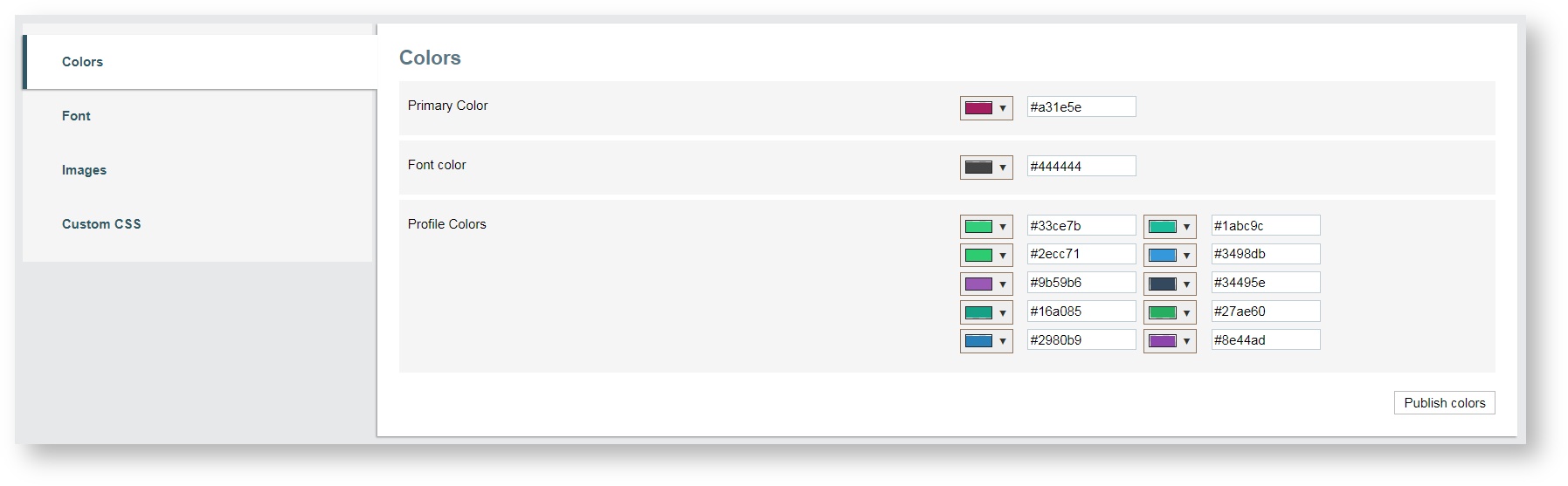
Change colors of either field by
- selecting any color from the color palette opening from the drop down menu
- adding the exact hex color code of a specific color into the input field next to it
Clicking Publish colors will change colors of all elements affected (either font or primary color or both) immediately for all pages and content of your portal.
Selecting font
Via Font in the menu Look & Feel, you can select different fonts to give your portal an individual look.
Add or change favicon, logo or image
You can even further personalize your portal‘s look by adding a favicon, logo and/or portal image on the field Look & Feel. When adding an image, you can allocate a background image to the portal tile, which will be visible in the portal overview subsequently. Add a favicon (the symbol displayed in a browser tab is called favicon), logo or portal image by either
- dragging & dropping a file into the field, or
- clicking into the favicon/logo field and select an image from your computer.
Your image/logo will be saved and added to your portal.
Currently supported file types are GIF, PNG, and JPEG. It is recommended to keep file sizes small as the images will not be processed after upload.
- Adapting the size of the image is only possible before upload.
Custom CSS
Custom CSS offers you the possibility to change the appearance of CSS components in the exterior view individually. You enter the CSS code to overwrite the standard CSS style.
- It is possible to customize the components of the portal's exterior view according to the corporate identity of your company.
Subnavigation: Participants
On this sub-navigation field a table is displayed which contains any participants located in groups assigned to a portal. If there is no group assigned, all participants located in the default panel group will be displayed. The table is equipped with the functionalities used by you to:
- search
- filter
- sort
- send an e-mail
- send a push notifiaction
- assign a role
- participant selection
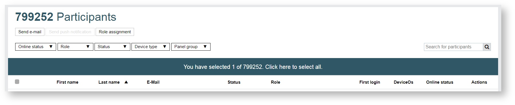
You use the search function to search for participants. You use alphanumeric characters for your search. The green banner indicates how many participants have been selcted. You can select or deselect all participants by clicking on this banner. In the header row of the participants table you can select or deselect all participants by clicking on the check box. In addition, you find the following headings:
- First name
- Last name
- Status
- Role
- First login
- DeviceOs
- Online status
- Actions
The participants can be sorted by:
- First name
- Last name
- Status
You select filters from the following drop-down lists:
- Online status
- Role
- Status
- Device type
- Panel group
Only if the portal app is used by at least one participant,you can use the function Send push notification.
Sending e-mail, push notification or assigning a role
On the right you will find three buttons: Send e-mail, Send push notification and Role assignment. The two buttons Send e-mail and Send push notification allow you to send an e-mail or a push notification. You use the third button Role assignment to assign one of the two roles or both of them to the selected participant(s). The buttons will be activated as soon as you have selected a participant.
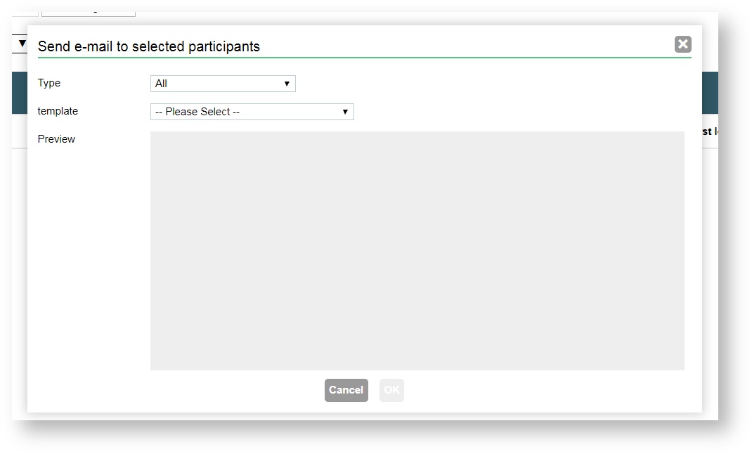
Send an e-mail
After selecting one, several or all participants, you click on the button Send e-mail. A modal opens immediately, with which you specify a type and a template. In order to specify a type you choose one of the available e-mail types. The following e-mail types are available: All, Default E-Mail, Invitation E-Mail, Password recovery E-Mail, Welcome mail. Under "template" you find the templates are created, Templates can be created and edited in the Library. In order to create templates specially for Portals you open the drop-down menu by clicking on the New draft arrow and select New draft for portals.
Send a push notification
The button for sending push notifications is only available, if the user has already registered for the portal with the app. In addition to that, a claim must have been assigned to the subnavigation field Settings under the tab Mobile Integration, via which the portal app can be reached. After clicking the button a modal opens and title and the message text can be entered by you.
Role assignment
If you want to assign a role, click either the button or the drop-down arrow in each table row. A modal opens immediately, with which one of the two roles or both of them are assigned to the selected participant(s). The roles you can select are: Moderator and Survey Manager.
Roles: Moderator and Survey Manager
Moderators possess an advanced rights profile and can actively engage in editing content displayed in your portal. As an example, comments or replies and even any panelists shouts can be edited, hidden or deleted by a moderator. Hidden contents will only be visible to moderators. Further settings define, whether only moderators can create new discussions, who will be allowed to invite other panelists to discussions, or whether discussions can be closed (and re-opened) by moderators.
- In order to edit, hide or delete content, click the menu located to the right in exterior view of your portal under module Discussionboard
- Click Edit.
The content can now be edited.
- If you would like to hide the content from the portal, click Withdraw.
The selected content is now hidden.
Survey Manager
In the role of the Survey Manager, portal users can use the page module Feedback Assistant.
- A crown at the user icon marks portal users as moderator. A corresponding quick info additionally indicates a user as moderator by mouseover.
Subnavigation: Content
Depending on your requirements, portals can be used for various purposes. Your Portal can be designed to provide panelists with information such as images and texts and you may have them participate in discussions or surveys. Therefore, you use the tabs Discussion boards, Tags and Topics.
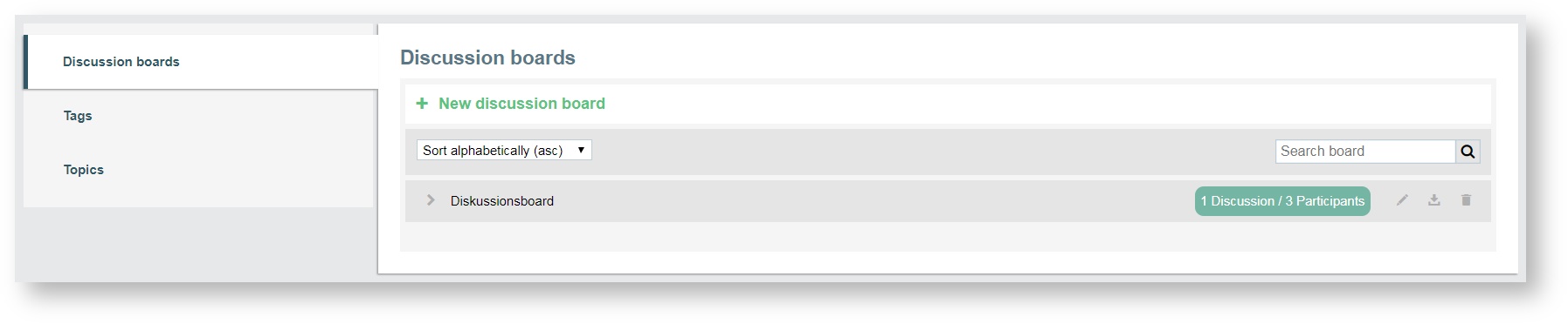
Discussion boards
A discussion board provides content within your portal. Each discussion board can be allocated to several modules, e. g. to the discussion list, a search result, or the discussion board module. Discussion boards are created and to a small extend edited on the subnavigation Content under the tab Discussion boards.
The following actions can be performed:
- assign a name for the discussion board
- restrict access to certain groups within your people data hub
- specify who can create discussions
- define who can invite further panelists to discussions on your portal.
The following control elements can be used:
- sorting of the discussion boards in an alphabetical ascending or descending order
- search function
- pen icon to edit the name
- export
- trashcan icon to delete the discussion board
Adding or deleting a discussion board
The default Portals package comes with a default discussion borad. For example. the discussion board can be defined as content for the discussion board module.
You proceed as follows:
- Under the tab Discussion boards on the sub-navigation field Conent, you click on + New discussion board and a new discussion board will be added.
- Add a specific name by clicking on the name of the discussion board or the pen icon and deleting the default title. Then add the new title. This title is not visible on the exterior portal view and it is used only on the CMS.
- You may delete any discussion board by clicking on the delete icon of the discussion board.This action cannot be undone and all content in the exterior view (images, videos and posts) will be deleted. It is recommended that the discussion board page module should either be deleted or a new discussion board should be defined as content for the page module.
Initially the discussion boards are public and can be accessed by anyone allowed to access the page containing the discussion board. It is possible to define access permissions for each discussion board.
Information
The discussion board will have to be selected in the discussion board page module in order to appear in the exterior portal view.
Discussion board settings
Define access for specific user groups and whether or not a specific role (moderator) is necessary in order to create discussions and send invitations. To adjust the title, the access permissions, the discussion creation, the invitations, you click on the drop-down arrow.
You grant access to Public, logged-in users and Group members.
- Discussion boards are by default set to by Public. You may set access to specific groups.
- You determine whether everybody or only moderators are allowed to create discussions.
You determine whether everybody or only moderators are allowed to create discussions.
- By default any panelist can create new discussions. However, you mayrestrict this right to moderators only.
You determine whether everybody, moderators, or moderators and authors are allowed to send invitations.
- This right is based on the role of a participant. Participants with respective roles can invite other panelists from the exterior portal view.
Exporting discussion boards
It is possible to export whole discussion boards including attached files from your portal. To export the board, click on the corresponding icon. Available export file types are XLSX and CSV.
Inviting panelists (exterior portal view)
Panelists with access to the portal can be invited to participate in a discussion. Go to the exterior view of your portal and open the respective discussion. You will have to log in with your panelist account information. The discussion‘s header will display information on the author of the discussion, its ratings and whether or not you are subscribed to this discussion. The button Invite users is located to the right.
- Click Invite users.
A window opens. All panelists available for invitation will be displayed, together with their status indicating, whether or not they have been previously invited to this discussion.
- Select the panelists you would like to invite.
- Click Invite.
Invited panelists will be notified through the notification module. Discussion or user generated content can be assigned topics. This content may also include tags.
Information
Please note that only panelists with the respective user rights can invite other panelists to discussions.
Tags
Discussion or user generated content can be tagged. Tags can be used in posts in the exterior portal view for bottom-up classification, e. g. describing, marking or relating. All panelists can create tags for posts (discussions, comments or replies) they create. These tags will start with a hashtag (#) immediately followed by a word or unspaced phrase. Tags created by panelists will be listed in the Tags tab where they can be monitored and maintained. New tags can also be added within the Tags tab which will also appear in the type ahead function for panelists in the exterior view, as soon as they start tagging, i. e. as soon as the hashtag (#) is entered. Tags are configured to begin with a lower-case letter and are sorted automatically in either ascending or descending order (as selected).
- The figure in the green box shows the usage of the tag.
- You can maintain tags for both blocked and allowed content.
Adding and editing Tags
New tags will be added to your list of tags as soon as they are added to a panelist‘s post in the exterior view. However, you can also add tags in the Tags tab.
- Click on + New tag to add a new tag.
- Click on the tag‘s name or on the pen icon to edit its name.
After assigning a name, a new tag will appear in the list of tags.
- Delete a tag by clicking the delete icon to the far right in the tag‘s row.
Blocked tags
A tag can be blocked by clicking on the Block tag icon. A blocked tag can be unblocked (switched to state allowed) in the same way. Create blocked tags in order to prevent undesirable tags from being used in content created by your portal‘s panelists.
Information
The panelists in your portal will still be able to tag a blocked word, however, it will not appear as a tag and therefore cannot be tracked to the content.
A blocked tag is indicated by a red icon, whereas a tag which is allowed will feature the same icon in gray color. Depending on the state of the tag, the icon will either block or unblock a tag.
Topics
Discussion or user generated content can be assigned to different kind of topics. Topics and Subtopics created here can be used in various contents on the exterior view of the portal, such as shouts or discussions. Topics and subtopics will be assigned during creation of the content. If a subtopic is assigned, the superior topic will not be displayed.
Discussions can be sorted by topics, or a panelist can subscribe to content of a specific
topic.
- Click + New Topic.
- Enter the name of the new topic into the entry filed and click the green check mark.
Your topic will be created.
- A subtopic can be created by clicking on the arrow button to the left of the topic title.
- Click +New subtopic and enter the title of the new subtopic.
The subtopic will be displayed indented below its superior topic. Furthermore it is possible to edit your topic by clicking on the edit button to the right and even to assign specific colors to your topics. Colors selected for topics will automatically be assigned to their subtopics.
Subnavigation: Settings
This field contains all the important tabs to configure your portal.
The following tabs are available:
- General Settings in Portals
- Portal Language
- Page connections
- Access Permissions
- Profile Settings
- Portal Switch
- Mobile Integration
Above the tabs you find a search function that allows you to search for a single tab.
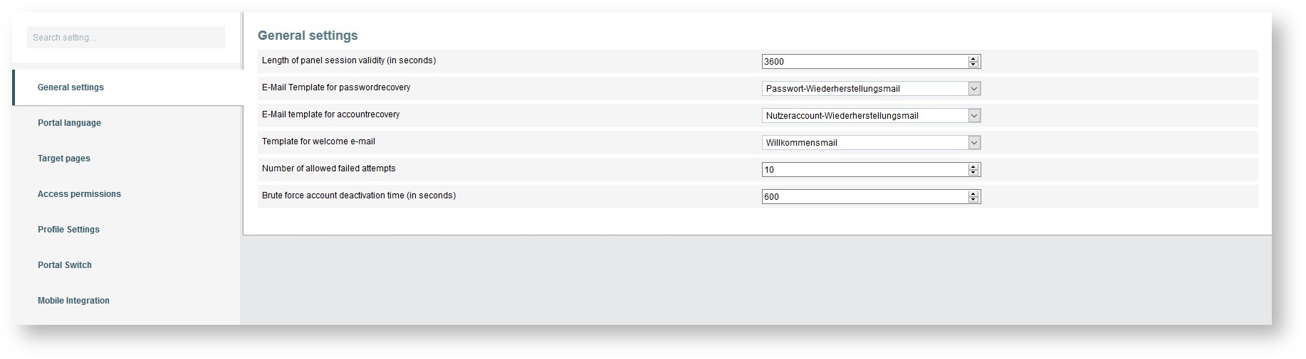
General Settings in Portals
You use this tab to define the general settings of your portal.
The general settings are:
- Length of panel session validity (in seconds)
- E-Mail Template for passwordrecovery
- E-Mail template for accountrecovery
- Template for welcome e-mail
- Number of allowed failed attemps
- Brute force account deactivation (in seconds)m
Predefined templates can be selected for the welcome e-mail, accountrecovery mail and Passwordrecovery mail using a drop-down list.
Information
The mail templates can be created and edited in the Library → Mail templates. In order to create portal-specific mail templates, click on the drop-down menu of the New draft button and select New draft for portals. Refer to the survey user manual for further details on mail templates.
Portal Language
All available phrases used in the portal will be displayed in the selected language and can be edited for each portal. The area is divided into two parts: "Portal language" and "Translation". Under the heading "Portal language", you have the option of setting the portal language. The system counts the number of phrases and how many of them have been translated.
Under the heading "Translation" you have the options to Reset translation, Export and Import the phrases. There is a search function, too. The header line of the table contains the following column headings, according to which you can sort by:
- Phrase ID
- Default phrase
- Translation
Export / Import
You can export and import user-defined translations for standard phrases of a portal. This way, you‘re able to export your data, send them to a translation agency for example and import the translated data into the system later.
Export
In order to export translations of a portal, click on the button Export in the Translation area.
Import
In order to import translations of a portal, click on the button Import in the Translation area and select the file containing your translated phrases.
Information
The export/import of translations requires an installed software program of Microsoft Excel.
Page connections
Pages available in your portal can be linked to the following target pages:
- Default landing page
- Target page after successful login
- Target page after first login
- Target page after logout
- User profile
- Single discussion
- Terms & Conditions
- Notification center
- Topic list
- Reports
Some target pages may be assigned to specific pages already. However, you may assign other pages to the available target pages.
Access Permissions
The Access Permissions tab offers settings concerning access rights. Several types of admissions for panelists can be set as well.
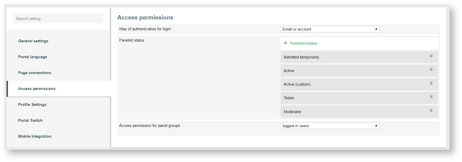
You start with the "Way of authentication for login" and choose between the three options via drop-down list:
- account
- e-mail or account
You continue with the "Panelist status". Several possible statuses are available for selection. You may also add custom panelist statuses. The options available are:
- admitted temporarily
- invited
- Active
- Tester
- Moderator
The panelist statuses set here will be decisive for who exactly will be granted access to the portal. Generally it will be every panelist in your data base, however, only panelists matching the statuses activated in this setting will be able to access the portal. Panelist statuses are set in EFS People.
At least you grant "Access permissions for panel groups" . You define whether only group members or all registered panelists are granted access to your portal.
Assign Access to Groups only
By default all panelists will have access to your portal without further adjusting access rights.
It is possible to further restrict access, based on panel groups.
- Select Group members from the drop down menu in the Access permission for panel groups paragraph.
- Click on + Panel Group.
A drop down menu appears.
- Select a group and click the green check mark icon.
Your group will be added. You can add as many groups as required. Delete groups from the list if necessary using the trashcan icon. Note that this action will only delete a group from the list, not the group itself. Panel groups can be created in EFS Panel and are a prerequisite for restricting access to group members.
Variables can be selected in order to display specific information in a panelist‘s profile page of the exterior view. Variables can be selected and pre-defined labels can be renamed to meet your requirements. The label will later serve as a description for the defined information on a panelist‘s profile page. Define through a check box whether or not a panelist should be able to edit their personal information on their profile page.
Profile Settings
If additional variables are required, you click on + New Field to add another set of variable and label fields. The arrow-icons will help you adjust the order of the variables as they will be displayed in a panelist‘s profile in the exterior view.
You make the information about the panelists available to the Groups user so that they can be uniquely identified.
Information
The panelist information must be released first in EFS Panel (Panelist administration → Profile Settings) before the information becomes available to use in Portals. The option Show profile to others must be checked.
Portal Switch
With the Portal Switch, portal users are able to switch from one portal to another without having to login again. Before you run this switch, you make some settings under the tab Portal Switch. You check the checkboxes to:
- indicate whether the portal selection should be shown in the header
- select the portals displayed in the exterior view
- highlight the new portal in the portal section
- show a counter for new portals in the header
You use the drop-down list in the row "Selectable Portals" to select those portals that can be switched between in the exterior view of your portal. You can either select individual portals that you want to switch between, or you can simply choose all portals. All portals created in the portal overview are available for your selection.
Mobile Integration
The TivianPortals app allows panelists mobile access to a portal. For this to work, there are a few prerequisites that must be met:
Claim:
A claim must be defined in order to allow panelists access to the portal through the mobile App. You define a claim by clicking on the input field and typing in your desired name. You use this name as a claim if you want to log in to your portal using the app.
- The maximum number of characters that can be used is 255.
- If a claim has already been created by another user and is used in the Portals app, you cannot create the same claim. In this case, you just have to define another claim, that has not been assigned yet.
- When specifying a claim, consider that the string must be entered in the app. For practical reasons, it is therefore advisable to limit the number of characters to a manageable number.
- You can assign a maximum of 3 claims per installation.
If you want to access a specific portal using an app, enter the claim previously assigned. The desired portal opens immediately on the mobile device.
Proper settings in Portal:
For the Portals app to be properly displayed, you have make the following settings:
- Open the Settings page of your portal.
- Under the General settings menu item, find the option Select whether a header with X-Frame-Options should be sent to the client.
- From the drop-down menu to the right, choose Do not send for the above option.
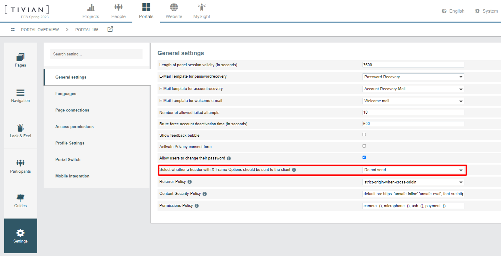
Information
If you do do make this setting and try to use the Portals app, this will lead to a display error in the app.
© 2024 Tivian XI GmbH